Skip to main content
Donor Science
Home
About Us
Services
Data Mining
AI – Discover New Major Gift Donors
DonorFAM
DonorFocus Model Scoring – AI
DonorSearch Wealth & Philanthropy Append
Survey creation
Clients
Testimonials
Blog
Contact
Send us a message
Blog
Home
Blog
November 14, 2025
I don’t use AI
Read More
February 28, 2025
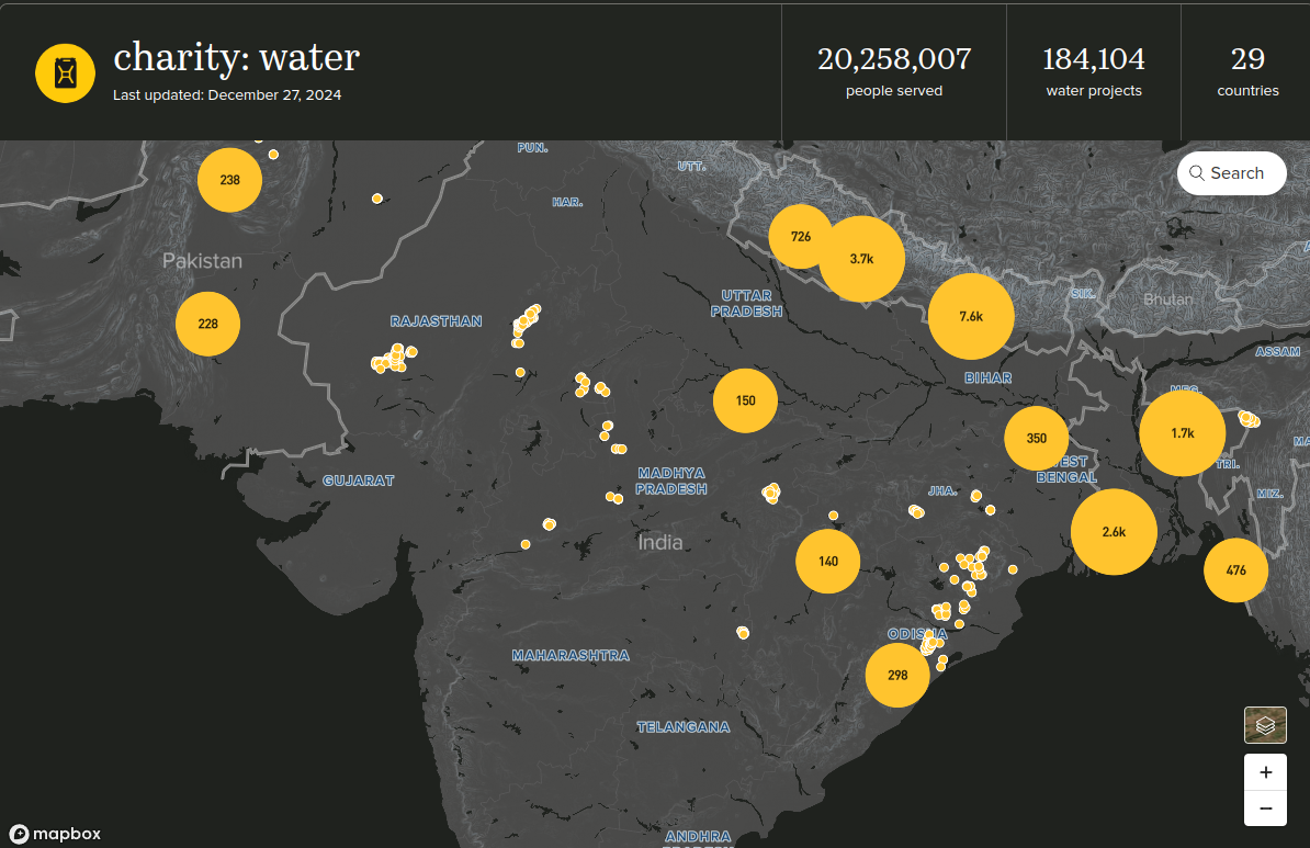
Charity: water – A charity that knows the value of a map
Read More
September 30, 2024
When the COVID-Fundraising Drugs Wore Off
Read More
April 1, 2024
Canadian Donor Dashboard – 2022 Edition
Read More
January 16, 2024
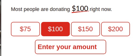
“Most people are donating $100 right now” ????
Read More
November 6, 2023
Stats are better than stories
Read More
October 31, 2023
When industry standard doesn’t make enough sense
Read More
July 8, 2022
How to Win Campaigns and Influence People
Read More
January 5, 2022
Reflections of a Data Nerd on Business Development
Read More
October 5, 2021
Lessons I’ve Learned Making 2 Online Dashboards
Read More
March 14, 2021
Canadian Donor Dashboard – 2020 Edition
Read More
February 7, 2021
#GivingTuesday tweets that got noticed vs those that didn’t
Read More
1
2
3
4